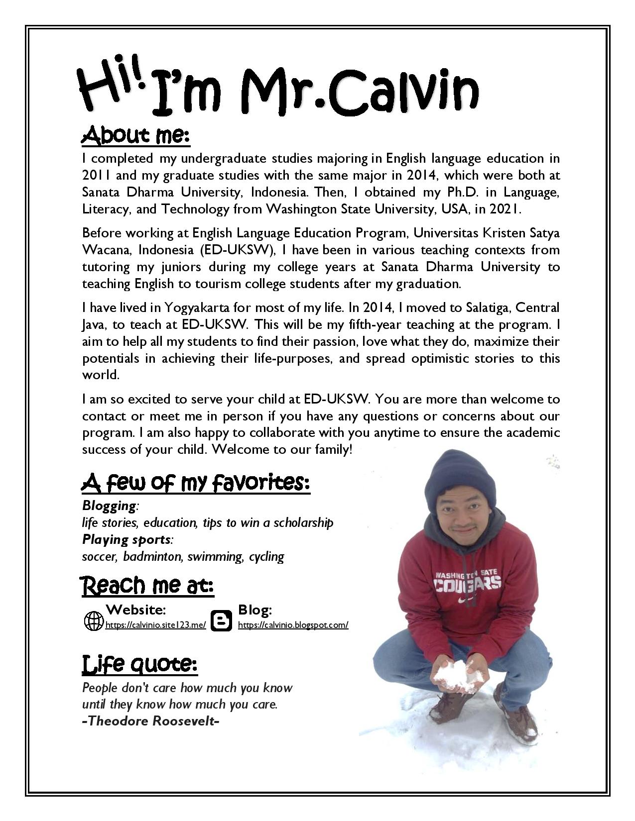
Newsletter: Mr.Calvin
Brief descriptions about the design:
The design is called newsletter. I have made some repetitions there. First, I use the same font (e.g., Kristen ITC) for the title and all subtitles (e.g., about me, a few of my favorites, reach me at, and life quote). Second, I repeatedly bold and underline all of the subtitles to make an apparent contrast. Next, I use the same font (e.g., Gill Sans MT) and size (e.g., mostly 14) for the content of the newsletter. Another repetition I made is to justify all of the text in the newsletter; this is also to ensure the alignment of the information. Last, I adjust the space between one subtitle to the others to make connections among them. Thank you!
Final version
You may download the PDF file of this design from this link: https://bit.ly/2rYToJU (Please open it in a new tab).